最新下载


24小时阅读排行榜
- 1 javascript async/await是什么_如何简化异步代码【教程】
- 2 php连接数据库要装啥驱动_php数据库驱动安装教程【步骤】
- 3 PWA如何实现离线XML数据暂存和后台上传
- 4 css宽高属性设置_如何控制元素尺寸
- 5 如何在Golang中优化RPC调用效率_Golang RPC性能优化实践
- 6 php统计数据图表颜色自定义_php配色数组设置法【步骤】
- 7 c# Barrier 和 CountdownEvent 的区别 c#多线程同步
- 8 Go语言如何对数据库进行测试_DB测试方案分析
- 9 XML上传的日志记录 应该记录哪些关键信息
- 10 C# 文件和目录的监视 - FileSystemWatcher的使用
- 11 php实现班级通信录怎么导入嵌套数组_php解析数组填通信录【步骤】
- 12 Go测试如何防止全局变量影响_测试隔离思路讲解
- 13 XSLT如何根据条件改变输出 xsl:if和xsl:choose
- 14 css 布局中 footer 无法贴底怎么办_使用 css 布局实现底部固定
- 15 php二维转一维保留首次键_php二维转一维首键优先法【步骤】
最新教程

-
- Node.js 教程
- 16117 2025-08-28
-
- CSS3 教程
- 1546542 2025-08-27
-
- Rust 教程
- 23250 2025-08-27
-
- Vue 教程
- 25723 2025-08-22
-
- PostgreSQL 教程
- 22206 2025-08-21
-
- Git 教程
- 9192 2025-08-21
<head>
<meta charset="utf-8">
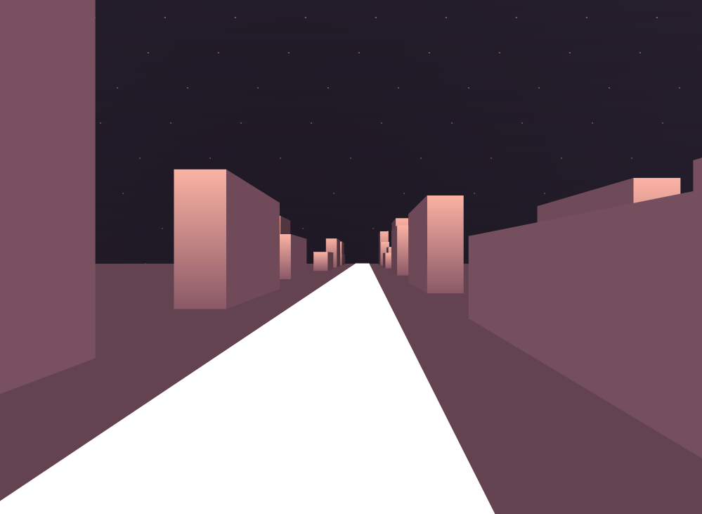
<title>css3模拟3D效果城市夜间行走动画特效</title>
<style>
body {
position: relative;
width: 100vw;
height: 100vh;
display: flex;
justify-content: center;
align-items: center;
background: radial-gradient(circle at center, #1f1925, #2c2334);
overflow: hidden;
}
body:before, body:after {
content: '';
position: absolute;
width: 200%;
height: 50%;
left: -50%;
top: calc(50% + 10px);
background: #644350;
}
body:after {
z-index: -1;
height: calc(50% + 500px);
top: -250px;
background: linear-gradient(to top, #1f1925, rgba(255, 255, 255, 0)), radial-gradient(circle at center, #fcb3a4, #fcb3a4 1px, rgba(255, 255, 255, 0) 1px, rgba(255, 255, 255, 0) 20px), radial-gradient(circle at center, #fcb3a4, #fcb3a4 1px, rgba(255, 255, 255, 0) 1px, rgba(255, 255, 255, 0) 20px);
background-size: 100%, 100px 100px, 100px 100px;
background-position: 50%, 40px 40px, 0px 90px;
opacity: 0.75;
transform-style: preserve-3d;
animation: starwipe 10s linear infinite;
}
这是一款很酷炫的纯css3实现的模拟3D效果城市夜间行走动画特效,css3立体建筑物动画效果。


相关推荐
热门下载


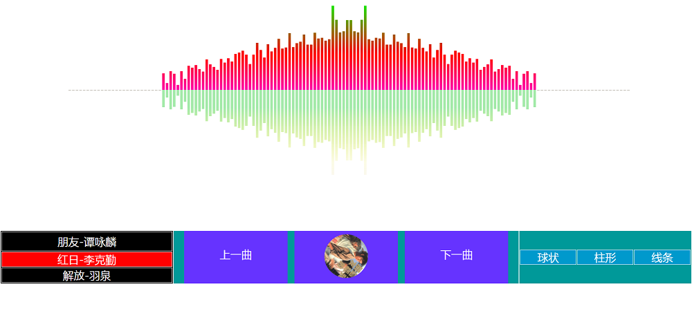
canvas音谱可视化mp3音乐播放器代码