在flutter中,有多种按钮组件可以供开发者使用,例如raisedbutton、flatbutton、iconbutton、outlinebutton、buttonbar和floatingactionbutton等。以下是对这些按钮组件的详细介绍:
-
RaisedButton:这是一种具有Material Design风格的凸起按钮。以下是其主要属性及其描述:
属性 描述 textColor 文本颜色 color 按钮背景颜色 disabledColor 按钮被禁用时的背景颜色 disabledTextColor 按钮被禁用时的文本颜色 splashColor 点击按钮时水波纹的颜色 highlightColor 长按按钮时高亮的颜色 elevation 按钮的阴影范围 padding 按钮的内边距 shape 按钮的形状 FlatButton:这是一种扁平化的按钮,通常用于界面中需要较少视觉强调的部分。
OutlineButton:这是一种线框按钮,通常用于界面中需要更低视觉强调的部分。
ButtonBar:这是一种用于排列多个按钮的组件,通常用于界面中需要展示一组按钮的地方。
-
FloatingActionButton:这是一种浮动按钮,通常用于界面中需要快速访问某个功能的地方。以下是其主要属性及其描述:
属性 描述 child 子视图,通常为一个图标 tooltip 长按时显示的提示信息 backgroundColor 按钮的背景颜色 elevation 未点击时的阴影 highlightElevation 点击时的阴影 onPressed 点击事件的回调函数 shape 按钮的形状 mini 是否为小型按钮

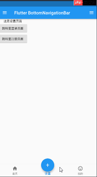
以下是一个仿照咸鱼首页居中的按钮示例代码:
class Tabs extends StatefulWidget {
  final index;
  Tabs({this.index = 0});

  @override
  State<StatefulWidget> createState() {
    return _TabsState(index);
  }
}

class _TabsState extends State<Tabs> {
  List<Widget> _pages = [HomePage(), SettingPage(), MinePage()]; // 用于存放对应的页面
  int _bottomIndex = 0;

  _TabsState(index) {
    _bottomIndex = index;
  }

  @override
  Widget build(BuildContext context) {
    return Scaffold(
      appBar: AppBar(title: Text('Flutter BottomNavigationBar')),
      body: this._pages[_bottomIndex],
      floatingActionButton: Container(
        width: 80,
        height: 80,
        padding: EdgeInsets.all(10),
        margin: EdgeInsets.only(top: 8),
        decoration: BoxDecoration(
          borderRadius: BorderRadius.circular(40),
        ),
        child: FloatingActionButton(
          child: Icon(Icons.add),
          onPressed: () {
            setState(() {
              _bottomIndex = 1;
            });
          },
        ),
      ),
      floatingActionButtonLocation: FloatingActionButtonLocation.centerDocked,
      bottomNavigationBar: BottomNavigationBar(
        iconSize: 25,
        type: BottomNavigationBarType.fixed,
        currentIndex: this._bottomIndex,
        onTap: (index) {
          setState(() {
            this._bottomIndex = index;
          });
        },
        items: [
          BottomNavigationBarItem(
            icon: Icon(Icons.home),
            title: Text('首页')
          ),
          BottomNavigationBarItem(
            icon: Icon(Icons.settings),
            title: Text('设置')
          ),
          BottomNavigationBarItem(
            icon: Icon(Icons.mood),
            title: Text('我的')
          ),
        ],
      ),
      drawer: Drawer(
        child: Column(
          children: <Widget>[
            Row(
              children: <Widget>[
                UserAccountsDrawerHeader(),
              ],
            ),
            ListTile(
              leading: CircleAvatar(
                child: Icon(Icons.home),
              ),
              title: Text('空间'),
            ),
            Divider(),
            ListTile(
              leading: CircleAvatar(
                child: Icon(Icons.people),
              ),
              title: Text('用户中心'),
            ),
            Divider(),
          ],
        ),
      ),
      endDrawer: Drawer(
        child: Column(
          children: <Widget>[
            ListTile(
              leading: CircleAvatar(
                child: Icon(Icons.settings),
              ),
              title: Text('设置中心'),
            ),
            Divider(),
          ],
        )
      ),
    );
  }
}