最新下载


24小时阅读排行榜
- 1 php实现班级通信录导入字段不匹配_php映射字段匹配教程【技巧】
- 2 如何在 pytest-html-reporter 中为测试用例添加自定义消息
- 3 如何让 div 在不同屏幕尺寸下保持一致的布局效果
- 4 php如何获取空数组下标_php空数组下标检测法【教程】
- 5 Python C 扩展存在的意义
- 6 numpy 如何用 np.nanmean / np.nanstd 处理 nan 的统计函数
- 7 php分割文本含换行和逗号混合_php混合分隔符分割preg_split【步骤】
- 8 如何用javascript实现数组排序【教程】
- 9 php数组怎么按索引奇偶筛选_php数组索引奇偶筛选法【步骤】
- 10 Linux inode 用尽的真实原因
- 11 php判断拼接后字符串长度_php连接字符串长度计算【步骤】
- 12 javascript为何存在事件冒泡机制【教程】
- 13 php实时输出断网重连会丢数吗_php实时输出断网处理【技巧】
- 14 如何在 ES6 中遍历对象内嵌的多个数组
- 15 模块捆绑工具如Webpack对javascript有何意义【教程】
最新教程

-
- Node.js 教程
- 16348 2025-08-28
-
- CSS3 教程
- 1547074 2025-08-27
-
- Rust 教程
- 23466 2025-08-27
-
- Vue 教程
- 25894 2025-08-22
-
- PostgreSQL 教程
- 22393 2025-08-21
-
- Git 教程
- 9338 2025-08-21
这是一款纯css3实现的太空中宇航员掉落动画效果
<style>
*{
margin: 0;
padding: 0;
}
body{
background-color: #102037;
overflow: hidden;
}
@-webkit-keyframes snow {
0% { opacity: 0; -webkit-transform: translateY(0px); transform: translateY(0px); }
20%{ opacity: 1;}
100% { opacity: 1; -webkit-transform: translateY(650px); transform: translateY(650px); }
}
@keyframes snow {
0% { opacity: 0; -webkit-transform: translateY(0px); transform: translateY(0px); }
20%{ opacity: 1;}
100% { opacity: 1; -webkit-transform: translateY(650px); transform: translateY(650px); }
}
@-webkit-keyframes astronaut{
0%{
-webkit-transform: rotate(0deg);
transform: rotate(0deg);
}
100%{
-webkit-transform: rotate(360deg);
transform: rotate(360deg);
}
}
.box-of-star1,
.box-of-star2,
.box-of-star3,
.box-of-star4{
width: 100%;
position: absolute;
z-index: 10;
left: 0;
-webkit-transform: translateY(650px);
transform: translateY(650px);
}
.box-of-star1{
-webkit-animation: snow 5s linear infinite;
}
.box-of-star2{
-webkit-animation: snow 5s -1.64s linear infinite;
}
.box-of-star3{
-webkit-animation: snow 5s -2.30s linear infinite;
}
.box-of-star4{
-webkit-animation: snow 5s -3.30s linear infinite;
}
.star{
width: 3px;
height: 3px;
border-radius: 50%;
background-color: #FFF;
position: absolute;
z-index: 10;
opacity: .7;
}
.star:before{
content: "";
width: 6px;
height: 6px;
border-radius: 50%;
background-color: #FFF;
position: absolute;
z-index: 10;
top: 40px;
left: 70px;
opacity: .7;
}


相关推荐

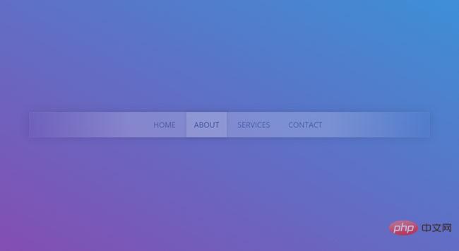
简单好看的导航栏特效代码

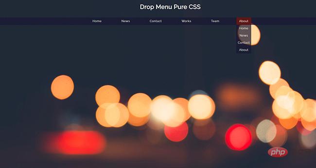
CSS3菜单悬停滑动效果图片
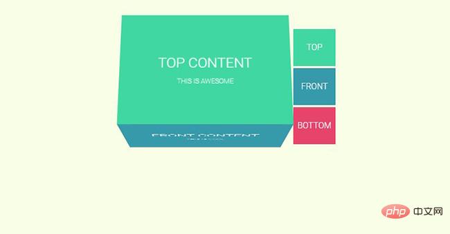
CSS3 3D翻转Tab选项卡切换插件


热门下载

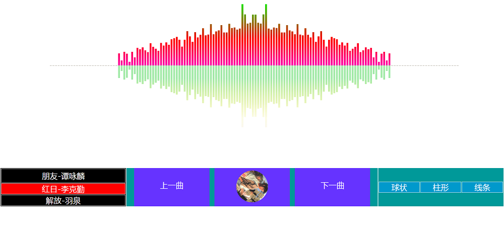
canvas音谱可视化mp3音乐播放器代码