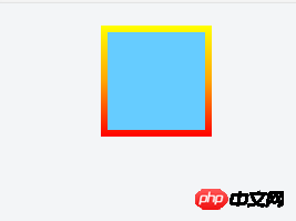
.border {
    width: 100px;
    height: 100px;
    background: #6CF;
    border: 6px solid #F33;
    margin: 20px auto;
    border-image: linear-gradient(to top, red, orange, yellow) 6;
    -moz-border-radius: 15px 25px !important;
    -webkit-border-radius: 15px 25px !important;
    border-radius: 15px 25px !important;
}
用border-image写了一个渐变,同时想要写一个圆角,写了border-radius但是并无作用,border-image不能实现圆角功能么


Copyright 2014-2026 https://www.php.cn/ All Rights Reserved | php.cn | 湘ICP备2023035733号


 5
5 1421
1421


 收藏
收藏


再嵌套一层,设置外层的圆角 +
overflow:hidden。.border{
}
.border::after{
}
border-radius
这个可以吧 我映象中一直用这个