


这篇文章主要介绍了使用css3绘制基本卡通图案的示例分享,不过必须承认,这样做的代码量并不是很少...well,需要的朋友可以参考下
纯HTML+CSS实现阿童木头像
先上最终效果图:
在里面主要用的了CSS中的几个属性:position—定位;border-radius—圆角;box-shadow—阴 影;background(linear-gradient)—渐变;transform—旋转和变换;animation —动画,技术点不是很多,主要是细心和耐心。还是直接上最终源码吧。由于考虑浏览器的CSS兼容性,代码比较多。
<!DOCTYPE html>
<html xmlns="http://www.w3.org/1999/xhtml">
<head>
<meta content="text/html; charset=utf-8" http-equiv="Content-Type" />
<title>纯CSS漫画</title>
<style type="text/css">
* {
margin: 0;
padding: 0;
}
.outer-circle {
position: absolute;
top: 32px;
left: 44px;
width: 289px;
height: 289px;
border: 4px solid #75BD4F;
-moz-border-radius: 50%;
-webkit-border-radius: 50%;
border-radius: 50%;
}
.inner-circle {
position: relative;
width: 269px;
height: 269px;
border: 10px solid #F5F910;
-moz-border-radius: 50%;
-webkit-border-radius: 50%;
border-radius: 50%;
background-color: #73BF43;
}
.inner-circle p {
position: absolute;
}
.inner-circle-light {
top: 41px;
left: 35px;
-moz-box-shadow: 26px 26px 29px 37px #fff;
-webkit-box-shadow: 26px 26px 29px 37px #fff;
box-shadow: 26px 26px 29px 37px #fff;
}
.header-top {
top: 11px;
rightright: 2px;
z-index: 100;
width: 180px;
height: 90px;
-moz-border-radius: 90px 90px 0 0;
-webkit-border-radius: 90px 90px 0 0;
border-radius: 90px 90px 0 0;
background-color: #000;
-moz-transform: rotate(32deg);
-ms-transform: rotate(32deg);
-o-transform: rotate(32deg);
-webkit-transform: rotate(32deg);
transform: rotate(32deg);
}
.header-left {
top: -20px;
left: 37px;
width: 114px;
height: 228px;
-moz-border-radius: 228px 0 0 228px;
-webkit-border-radius: 228px 0 0 228px;
border-radius: 228px 0 0 228px;
background-color: #000;
-moz-transform: rotate(26deg);
-ms-transform: rotate(26deg);
-o-transform: rotate(26deg);
-webkit-transform: rotate(26deg);
transform: rotate(26deg);
}
.hair-left-1 {
top: 15px;
left: 53px;
z-index: 55;
width: 85px;
height: 23px;
-webkit-border-top-left-radius: 30px 180px;
border-top-left-radius: 30px 180px;
-webkit-border-bottom-left-radius: 30px 80px;
border-bottom-left-radius: 30px 80px;
background-color: #000;
-moz-transform: rotate(-74deg) skew(-42deg, 23deg);
-ms-transform: rotate(-74deg) skew(-42deg, 23deg);
-o-transform: rotate(-74deg) skew(-42deg, 23deg);
-webkit-transform: rotate(-74deg) skew(-42deg, 23deg);
transform: rotate(-74deg) skew(-42deg, 23deg);
}
.hair-left-2 {
top: -20px;
left: 99px;
z-index: 60;
width: 49px;
height: 37px;
background-color: #000;
-moz-transform: rotate(-51deg) skew(-43deg, 0deg);
-ms-transform: rotate(-51deg) skew(-43deg, 0deg);
-o-transform: rotate(-51deg) skew(-43deg, 0deg);
-webkit-transform: rotate(-51deg) skew(-43deg, 0deg);
transform: rotate(-51deg) skew(-43deg, 0deg);
}
.hair-rightright-1 {
top: 70px;
rightright: 1px;
z-index: 60;
width: 81px;
height: 85px;
-webkit-border-top-rightright-radius: 26px 120px;
border-top-rightright-radius: 26px 120px;
background-color: black;
-moz-transform: rotate(1deg) skew(-51deg, 0deg);
-ms-transform: rotate(1deg) skew(-51deg, 0deg);
-o-transform: rotate(1deg) skew(-51deg, 0deg);
-webkit-transform: rotate(1deg) skew(-51deg, 0deg);
transform: rotate(1deg) skew(-51deg, 0deg);
}
.hair-rightright-2 {
width: 60px;
height: 10px;
-webkit-border-bottom-left-radius: 100%;
border-bottom-left-radius: 100%;
background-color: rgba(0,0,0,0.2);
}
.hair-light-1 {
top: 30px;
rightright: 45px;
z-index: 105;
width: 57px;
height: 17px;
-moz-border-radius: 100%;
-webkit-border-radius: 100%;
border-radius: 100%;
background-color: white;
-moz-transform: rotate(39deg);
-ms-transform: rotate(39deg);
-o-transform: rotate(39deg);
-webkit-transform: rotate(39deg);
transform: rotate(39deg);
}
.hair-light-1-over {
top: 32px;
rightright: 38px;
z-index: 105;
width: 83px;
height: 21px;
-moz-border-radius: 100%;
-webkit-border-radius: 100%;
border-radius: 100%;
background-color: black;
-moz-transform: rotate(41deg);
-ms-transform: rotate(41deg);
-o-transform: rotate(41deg);
-webkit-transform: rotate(41deg);
transform: rotate(41deg);
}
.hair-light-2 {
top: 16px;
rightright: 104px;
z-index: 105;
width: 4px;
height: 2px;
-moz-border-radius: 2px;
-webkit-border-radius: 2px;
border-radius: 2px;
background-color: white;
-moz-transform: rotate(10deg);
-ms-transform: rotate(10deg);
-o-transform: rotate(10deg);
-webkit-transform: rotate(10deg);
transform: rotate(10deg);
}
.ear {
top: 141px;
rightright: 36px;
z-index: 110;
width: 49px;
height: 48px;
border: 2px solid #000;
border-bottom-width: 1px;
-moz-border-radius: 50%;
-webkit-border-radius: 50%;
border-radius: 50%;
background-color: #F6C6B0;
-moz-box-shadow: -4px 0 0 0 #de9876 inset;
-webkit-box-shadow: -4px 0 0 0 #de9876 inset;
box-shadow: -4px 0 0 0 #de9876 inset;
-moz-transform: rotate(56deg) scaleY(1.4);
-ms-transform: rotate(56deg) scaleY(1.4);
-o-transform: rotate(56deg) scaleY(1.4);
-webkit-transform: rotate(56deg) scaleY(1.4);
transform: rotate(56deg) scaleY(1.4);
}
.ear-inner-1 {
top: 22px;
left: 22px;
z-index: 70;
width: 9px;
height: 5px;
border-top: 1px solid #110b00;
-moz-border-radius: 50%;
-webkit-border-radius: 50%;
border-radius: 50%;
-moz-transform: rotate(-6deg);
-ms-transform: rotate(-6deg);
-o-transform: rotate(-6deg);
-webkit-transform: rotate(-6deg);
transform: rotate(-6deg);
}
.ear-inner-2 {
top: 19px;
left: 18px;
width: 14px;
height: 7px;
border-top: 2px solid #110b00;
-moz-border-radius: 50%;
-webkit-border-radius: 50%;
border-radius: 50%;
-moz-box-shadow: 0px 2px 0 0 #de9876 inset;
-webkit-box-shadow: 0px 2px 0 0 #de9876 inset;
box-shadow: 0px 2px 0 0 #de9876 inset;
-moz-transform: rotate(-91deg);
-ms-transform: rotate(-91deg);
-o-transform: rotate(-91deg);
-webkit-transform: rotate(-91deg);
transform: rotate(-91deg);
}
.ear-light {
top: 21px;
rightright: 34px;
z-index: 105;
width: 17px;
height: 6px;
-moz-border-radius: 100%;
-webkit-border-radius: 100%;
border-radius: 100%;
background-color: #FFF;
-moz-transform: rotate(89deg);
-ms-transform: rotate(89deg);
-o-transform: rotate(89deg);
-webkit-transform: rotate(89deg);
transform: rotate(89deg);
}
.ear-over {
bottombottom: -44px;
left: -33px;
z-index: 55;
width: 69px;
height: 59px;
-moz-border-radius: 50%;
-webkit-border-radius: 50%;
border-radius: 50%;
background-color: #f6c6b0;
-moz-transform: rotate(26deg);
-ms-transform: rotate(26deg);
-o-transform: rotate(26deg);
-webkit-transform: rotate(26deg);
transform: rotate(26deg);
}
.face-main {
top: 30px;
left: 35px;
z-index: 50;
width: 180px;
height: 188px;
-moz-border-radius: 90px;
-webkit-border-radius: 90px;
border-radius: 90px;
background-color: #F6C6B0;
-moz-box-shadow: 3px -3px 0 0 #fff inset;
-webkit-box-shadow: 3px -3px 0 0 #fff inset;
box-shadow: 3px -3px 0 0 #fff inset;
}
.face-top {
top: 61px;
rightright: 75px;
z-index: 105;
width: 111px;
height: 46px;
-moz-border-radius: 50% 50% 26px 0;
-webkit-border-radius: 50% 50% 26px 0;
border-radius: 50% 50% 26px 0;
background-color: #f6c6b0;
-moz-transform: rotate(37deg);
-ms-transform: rotate(37deg);
-o-transform: rotate(37deg);
-webkit-transform: rotate(37deg);
transform: rotate(37deg);
}
.face-rightright-1 {
top: 115px;
rightright: 71px;
z-index: 105;
width: 68px;
height: 62px;
-moz-border-radius: 100% 0 0;
-webkit-border-radius: 100% 0 0;
border-radius: 100% 0 0;
background-color: #f6c6b0;
-moz-transform: rotate(99deg);
-ms-transform: rotate(99deg);
-o-transform: rotate(99deg);
-webkit-transform: rotate(99deg);
transform: rotate(99deg);
}
.face-bottombottom-1 {
bottombottom: 42px;
left: 45px;
z-index: 40;
width: 72px;
height: 52px;
-webkit-border-bottom-left-radius: 70px 40px;
-webkit-border-top-left-radius: 14px 11px;
border-top-left-radius: 14px 11px;
border-bottom-left-radius: 70px 40px;
background-color: #000;
}
.face-bottombottom-1-over {
bottombottom: 45px;
left: 48px;
z-index: 55;
width: 69px;
height: 47px;
-webkit-border-bottom-left-radius: 70px 40px;
-webkit-border-top-left-radius: 14px 11px;
border-top-left-radius: 14px 11px;
border-bottom-left-radius: 70px 40px;
background-color: #f6c6b0;
-moz-box-shadow: 3px 0px 0 0 #fff inset;
-webkit-box-shadow: 3px 0px 0 0 #fff inset;
box-shadow: 3px 0px 0 0 #fff inset;
}
.face-bottombottom-2 {
rightright: 97px;
bottombottom: 44px;
z-index: 55;
width: 43px;
height: 31px;
-webkit-border-bottom-rightright-radius: 70px 40px;
border-bottom-rightright-radius: 70px 40px;
background-color: #000;
-moz-transform: rotate(-4deg) skew(-49deg, 0deg);
-ms-transform: rotate(-4deg) skew(-49deg, 0deg);
-o-transform: rotate(-4deg) skew(-49deg, 0deg);
-webkit-transform: rotate(-4deg) skew(-49deg, 0deg);
transform: rotate(-4deg) skew(-49deg, 0deg);
}
.face-bottombottom-2-over {
rightright: 99px;
bottombottom: 46px;
z-index: 56;
width: 43px;
height: 31px;
-webkit-border-bottom-rightright-radius: 70px 40px;
border-bottom-rightright-radius: 70px 40px;
background-color: #f6c6b0;
-moz-box-shadow: -6px 2px 0 0 #de9876 inset;
-webkit-box-shadow: -6px 2px 0 0 #de9876 inset;
box-shadow: -6px 2px 0 0 #de9876 inset;
-moz-transform: rotate(-3deg) skew(-49deg, 0deg);
-ms-transform: rotate(-3deg) skew(-49deg, 0deg);
-o-transform: rotate(-3deg) skew(-49deg, 0deg);
-webkit-transform: rotate(-3deg) skew(-49deg, 0deg);
transform: rotate(-3deg) skew(-49deg, 0deg);
}
.face-light-1 {
rightright: 127px;
bottombottom: 95px;
z-index: 150;
width: 6px;
height: 6px;
-moz-border-radius: 50%;
-webkit-border-radius: 50%;
border-radius: 50%;
background-color: #fff;
}
.face-light-2 {
bottombottom: 82px;
left: 58px;
z-index: 150;
width: 4px;
height: 4px;
-moz-border-radius: 50%;
-webkit-border-radius: 50%;
border-radius: 50%;
background-color: #fff;
}
.chin {
bottombottom: 39px;
left: 111px;
z-index: 70;
width: 11px;
height: 12px;
border: 2px solid #000;
border-top-color: #f6c6b0;
border-left-color: #f6c6b0;
-webkit-border-bottom-rightright-radius: 6px;
border-bottom-rightright-radius: 6px;
background-color: #f6c6b0;
-moz-transform: rotate(34deg) skew(-9deg, 0deg);
-ms-transform: rotate(34deg) skew(-9deg, 0deg);
-o-transform: rotate(34deg) skew(-9deg, 0deg);
-webkit-transform: rotate(34deg) skew(-9deg, 0deg);
transform: rotate(34deg) skew(-9deg, 0deg);
}
.eye-rightright {
top: 97px;
left: 103px;
z-index: 110;
width: 39px;
height: 67px;
border: 1px solid #000;
border-top-width: 2px;
-moz-border-radius: 24px 43px 34px 28px / 34px 71px 34px 81px;
-webkit-border-radius: 24px 43px 34px 28px / 34px 71px 34px 81px;
border-radius: 24px 43px 34px 28px / 34px 71px 34px 81px;
background-color: #F8FAF7;
-moz-box-shadow: 0px 5px 0 0 #d5d9e2 inset;
-webkit-box-shadow: 0px 5px 0 0 #d5d9e2 inset;
box-shadow: 0px 5px 0 0 #d5d9e2 inset;
}
.eye-rightright-inner {
rightright: 0;
bottombottom: 3px;
z-index: 115;
width: 30px;
height: 52px;
-moz-border-radius: 32px 43px 28px 48px / 47px 55px 45px 75px;
-webkit-border-radius: 32px 43px 28px 48px / 47px 55px 45px 75px;
border-radius: 32px 43px 28px 48px / 47px 55px 45px 75px;
background-color: #000;
}
.eye-rightright-light1 {
top: 19px;
rightright: 0;
z-index: 120;
width: 19px;
height: 10px;
-moz-border-radius: 100%;
-webkit-border-radius: 100%;
border-radius: 100%;
background-color: #FFF;
-moz-animation: eye-flash 0.2s linear 0.1s infinite normal;
-o-animation: eye-flash 0.2s linear 0.1s infinite normal;
-webkit-animation: eye-flash 0.2s linear 0.1s infinite normal;
-moz-transform: rotate(41deg);
-ms-transform: rotate(41deg);
-o-transform: rotate(41deg);
-webkit-transform: rotate(41deg);
transform: rotate(41deg);
animation: eye-flash 0.2s linear 0.1s infinite normal;
}
@-webkit-keyframes eye-flash {
0% {
top: 19px;
}
100% {
top: 21px;
}
}
@-moz-keyframes eye-flash {
0% {
top: 19px;
}
100% {
top: 20px;
}
}
@-ms-keyframes eye-flash {
0% {
top: 19px;
}
100% {
top: 20px;
}
}
@keyframes eye-flash {
0% {
top: 19px;
}
100% {
top: 20px;
}
}
.eye-rightright-light2 {
bottombottom: 8px;
left: 9px;
z-index: 120;
width: 14px;
height: 7px;
-webkit-border-bottom-rightright-radius: 100%;
border-bottom-rightright-radius: 100%;
background-color: #FFF;
-moz-transform: rotate(-39deg);
-ms-transform: rotate(-39deg);
-o-transform: rotate(-39deg);
-webkit-transform: rotate(-39deg);
transform: rotate(-39deg);
}
.eye-rightright-eyelash1 {
top: 9px;
left: -3px;
width: 2px;
height: 4px;
background-color: #000;
-moz-transform: rotate(-54deg);
-ms-transform: rotate(-54deg);
-o-transform: rotate(-54deg);
-webkit-transform: rotate(-54deg);
transform: rotate(-54deg);
}
.eye-rightright-eyelash2 {
top: 1px;
left: 1px;
width: 2px;
height: 5px;
background-color: #000;
-moz-transform: rotate(-33deg);
-ms-transform: rotate(-33deg);
-o-transform: rotate(-33deg);
-webkit-transform: rotate(-33deg);
transform: rotate(-33deg);
}
.eye-rightright-eyelash3 {
top: -8px;
left: 8px;
width: 2px;
height: 7px;
background-color: #000;
-moz-transform: rotate(-21deg);
-ms-transform: rotate(-21deg);
-o-transform: rotate(-21deg);
-webkit-transform: rotate(-21deg);
transform: rotate(-21deg);
}
.eye-rightright-eyelash4 {
top: -6px;
left: 21px;
width: 2px;
height: 6px;
background-color: #000;
-moz-transform: rotate(11deg);
-ms-transform: rotate(11deg);
-o-transform: rotate(11deg);
-webkit-transform: rotate(11deg);
transform: rotate(11deg);
}
.eye-rightright-eyelash5 {
top: 1px;
rightright: 8px;
width: 2px;
height: 6px;
background-color: #000;
-moz-transform: rotate(14deg);
-ms-transform: rotate(14deg);
-o-transform: rotate(14deg);
-webkit-transform: rotate(14deg);
transform: rotate(14deg);
}
.eye-left {
top: 114px;
left: 45px;
z-index: 110;
width: 19px;
height: 63px;
border: 1px solid #000;
border-top-width: 2px;
-moz-border-radius: 29px 28px 33px / 97px 111px 40px 90px;
-webkit-border-radius: 29px 28px 33px / 97px 111px 40px 90px;
border-radius: 29px 28px 33px / 97px 111px 40px 90px;
background-color: #F8FAF7;
-moz-box-shadow: 0px 6px 0 0 #d5d9e2 inset;
-webkit-box-shadow: 0px 6px 0 0 #d5d9e2 inset;
box-shadow: 0px 6px 0 0 #d5d9e2 inset;
-moz-transform: rotate(-9deg);
-ms-transform: rotate(-9deg);
-o-transform: rotate(-9deg);
-webkit-transform: rotate(-9deg);
transform: rotate(-9deg);
}
.eye-left-inner {
rightright: 0;
bottombottom: 1px;
z-index: 115;
width: 15px;
height: 46px;
-moz-border-radius: 49px 44px 29px 58px / 143px 83px 45px 122px;
-webkit-border-radius: 49px 44px 29px 58px / 143px 83px 45px 122px;
border-radius: 49px 44px 29px 58px / 143px 83px 45px 122px;
background-color: #000;
}
.eye-left-light1 {
top: 19px;
rightright: 1px;
z-index: 120;
width: 7px;
height: 18px;
-moz-border-radius: 100%;
-webkit-border-radius: 100%;
border-radius: 100%;
background-color: #FFF;
-moz-animation: eye-flash 0.2s linear 0.1s infinite normal;
-o-animation: eye-flash 0.2s linear 0.1s infinite normal;
-webkit-animation: eye-flash 0.2s linear 0.1s infinite normal;
-moz-transform: rotate(-9deg);
-ms-transform: rotate(-9deg);
-o-transform: rotate(-9deg);
-webkit-transform: rotate(-9deg);
transform: rotate(-9deg);
animation: eye-flash 0.2s linear 0.1s infinite normal;
}
.eye-left-light2 {
bottombottom: 6px;
left: 4px;
z-index: 120;
width: 11px;
height: 4px;
-webkit-border-bottom-rightright-radius: 100%;
border-bottom-rightright-radius: 100%;
background-color: #FFF;
-moz-transform: rotate(-45deg);
-ms-transform: rotate(-45deg);
-o-transform: rotate(-45deg);
-webkit-transform: rotate(-45deg);
transform: rotate(-45deg);
}
.eye-left-eyelash1 {
top: 7px;
left: -1px;
width: 2px;
height: 4px;
background-color: #000;
-moz-transform: rotate(-49deg);
-ms-transform: rotate(-49deg);
-o-transform: rotate(-49deg);
-webkit-transform: rotate(-49deg);
transform: rotate(-49deg);
}
.eye-left-eyelash2 {
top: -1px;
left: 2px;
width: 2px;
height: 5px;
background-color: #000;
-moz-transform: rotate(-28deg);
-ms-transform: rotate(-28deg);
-o-transform: rotate(-28deg);
-webkit-transform: rotate(-28deg);
transform: rotate(-28deg);
}
.eye-left-eyelash3 {
top: -6px;
left: 7px;
width: 2px;
height: 5px;
background-color: #000;
-moz-transform: rotate(-4deg);
-ms-transform: rotate(-4deg);
-o-transform: rotate(-4deg);
-webkit-transform: rotate(-4deg);
transform: rotate(-4deg);
}
.eye-left-eyelash4 {
top: -4px;
left: 13px;
width: 2px;
height: 4px;
background-color: #000;
-moz-transform: rotate(25deg);
-ms-transform: rotate(25deg);
-o-transform: rotate(25deg);
-webkit-transform: rotate(25deg);
transform: rotate(25deg);
}
.eye-left-eyelash5 {
top: 3px;
rightright: 0;
width: 2px;
height: 4px;
background-color: #000;
-moz-transform: rotate(41deg);
-ms-transform: rotate(41deg);
-o-transform: rotate(41deg);
-webkit-transform: rotate(41deg);
transform: rotate(41deg);
}
.rightright-eyebrow {
top: 68px;
left: 92px;
z-index: 110;
width: 66px;
height: 36px;
border: 2px solid #000;
border-width: 2px 1px 0px 1px;
-moz-border-radius: 45px 51px 0 0;
-webkit-border-radius: 45px 51px 0 0;
border-radius: 45px 51px 0 0;
background-color: transparent;
-moz-transform: skew(-6deg, 16deg);
-ms-transform: skew(-6deg, 16deg);
-o-transform: skew(-6deg, 16deg);
-webkit-transform: skew(-6deg, 16deg);
transform: skew(-6deg, 16deg);
}
.rightright-eyebrow-over {
top: 21px;
rightright: -5px;
z-index: 115;
width: 13px;
height: 20px;
background-color: #f6c6b0;
}
.left-eyebrow {
top: 89px;
left: 36px;
z-index: 100;
width: 30px;
height: 68px;
border: 2px solid #000;
border-width: 2px 1px 0px 1px;
-moz-border-radius: 100%;
-webkit-border-radius: 100%;
border-radius: 100%;
background-color: transparent;
-moz-transform: rotate(-2deg);
-ms-transform: rotate(-2deg);
-o-transform: rotate(-2deg);
-webkit-transform: rotate(-2deg);
transform: rotate(-2deg);
}
.left-eyebrow-over {
top: 17px;
rightright: -9px;
z-index: 105;
width: 39px;
height: 55px;
-moz-border-radius: 21px 12px 0 17px;
-webkit-border-radius: 21px 12px 0 17px;
border-radius: 21px 12px 0 17px;
background-color: #f6c6b0;
-moz-transform: rotate(-13deg);
-ms-transform: rotate(-13deg);
-o-transform: rotate(-13deg);
-webkit-transform: rotate(-13deg);
transform: rotate(-13deg);
}
.nose {
top: 172px;
left: 63px;
z-index: 115;
width: 21px;
height: 16px;
border: 2px solid #000;
-moz-border-radius: 50%;
-webkit-border-radius: 50%;
border-radius: 50%;
-moz-box-shadow: 3px 1px 0 0 #fff inset;
-webkit-box-shadow: 3px 1px 0 0 #fff inset;
box-shadow: 3px 1px 0 0 #fff inset;
}
.nose-over {
top: -1px;
rightright: -11px;
z-index: 115;
width: 19px;
height: 14px;
background-color: #f6c6b0;
-moz-transform: rotate(31deg);
-ms-transform: rotate(31deg);
-o-transform: rotate(31deg);
-webkit-transform: rotate(31deg);
transform: rotate(31deg);
}
.nose-tip {
top: -7px;
left: 13px;
width: 2px;
height: 6px;
background-color: #000;
-moz-transform: rotate(14deg);
-ms-transform: rotate(14deg);
-o-transform: rotate(14deg);
-webkit-transform: rotate(14deg);
transform: rotate(14deg);
}
.mouth {
bottombottom: 61px;
left: 72px;
z-index: 110;
width: 46px;
height: 47px;
border: 2px solid #000;
border-width: 0 1px 2px 0;
-moz-border-radius: 32px 29px 23px 48px / 47px 82px 52px 75px;
-webkit-border-radius: 32px 29px 23px 48px / 47px 82px 52px 75px;
border-radius: 32px 29px 23px 48px / 47px 82px 52px 75px;
background-color: #92222E;
-moz-transform: rotate(1deg) skew(0deg, 39deg);
-ms-transform: rotate(1deg) skew(0deg, 39deg);
-o-transform: rotate(1deg) skew(0deg, 39deg);
-webkit-transform: rotate(1deg) skew(0deg, 39deg);
transform: rotate(1deg) skew(0deg, 39deg);
}
.mouth-over-1 {
bottombottom: 0;
left: -4px;
z-index: 115;
width: 37px;
height: 58px;
border-right: 1px solid #000;
-moz-border-radius: 38px 13px 10px 77px / 47px 82px 52px 73px;
-webkit-border-radius: 38px 13px 10px 77px / 47px 82px 52px 73px;
border-radius: 38px 13px 10px 77px / 47px 82px 52px 73px;
background-color: #f6c6b0;
-moz-transform: rotate(38deg) skew(0deg, 6deg);
-ms-transform: rotate(38deg) skew(0deg, 6deg);
-o-transform: rotate(38deg) skew(0deg, 6deg);
-webkit-transform: rotate(38deg) skew(0deg, 6deg);
transform: rotate(38deg) skew(0deg, 6deg);
}
.mouth-over-2 {
bottombottom: 38px;
left: 30px;
z-index: 150;
width: 7px;
height: 19px;
background-color: #f6c6b0;
-moz-transform: rotate(-233deg);
-ms-transform: rotate(-233deg);
-o-transform: rotate(-233deg);
-webkit-transform: rotate(-233deg);
transform: rotate(-233deg);
}
.mouth-over-3 {
bottombottom: -9px;
left: 11px;
z-index: 115;
width: 27px;
height: 9px;
border-top: 2px solid #000;
-moz-border-radius: 100%;
-webkit-border-radius: 100%;
border-radius: 100%;
background-color: #f6c6b0;
-moz-transform: rotate(-4deg);
-ms-transform: rotate(-4deg);
-o-transform: rotate(-4deg);
-webkit-transform: rotate(-4deg);
transform: rotate(-4deg);
}
.mouth-over-4 {
bottombottom: -6px;
left: -1px;
z-index: 150;
width: 7px;
height: 15px;
background-color: #f6c6b0;
-moz-transform: rotate(-226deg);
-ms-transform: rotate(-226deg);
-o-transform: rotate(-226deg);
-webkit-transform: rotate(-226deg);
transform: rotate(-226deg);
}
.mouth-tip {
bottombottom: 39px;
left: 41px;
z-index: 120;
width: 2px;
height: 3px;
background-color: #000;
-moz-transform: rotate(-51deg);
-ms-transform: rotate(-51deg);
-o-transform: rotate(-51deg);
-webkit-transform: rotate(-51deg);
transform: rotate(-51deg);
}
.mouth-inner {
bottombottom: 50px;
left: 107px;
z-index: 115;
width: 10px;
height: 18px;
-moz-border-radius: 10px 0 4px 6px / 8px 2px 8px 9px;
-webkit-border-radius: 10px 0 4px 6px / 8px 2px 8px 9px;
border-radius: 10px 0 4px 6px / 8px 2px 8px 9px;
background-color: #ed675c;
-moz-transform: rotate(6deg);
-ms-transform: rotate(6deg);
-o-transform: rotate(6deg);
-webkit-transform: rotate(6deg);
transform: rotate(6deg);
}
.name-lable {
bottombottom: -9px;
left: -8px;
z-index: 150;
width: 280px;
color: #005aa9;
text-align: center;
font-weight: bold;
font-style: italic;
font-size: 50px;
font-family: Times New Roman;
}
.name-lable-light {
top: 30px;
width: 100%;
height: 0;
-moz-box-shadow: 0 0 3px 3px #fff;
-webkit-box-shadow: 0 0 3px 3px #fff;
box-shadow: 0 0 3px 3px #fff;
}
@-webkit-keyframes input-flash {
0% {
border-color: #ccc;
-moz-box-shadow: inset 0 1px 1px rgba(0,0,0,0.075);
-webkit-box-shadow: inset 0 1px 1px rgba(0,0,0,0.075);
box-shadow: inset 0 1px 1px rgba(0,0,0,0.075);
}
100% {
border-color: rgba(82,168,236,0.8);
-moz-box-shadow: inset 0 1px 1px rgba(0,0,0,0.075), 0 0 10px rgba(82,168,236,0.6);
-webkit-box-shadow: inset 0 1px 1px rgba(0,0,0,0.075), 0 0 10px rgba(82,168,236,0.6);
box-shadow: inset 0 1px 1px rgba(0,0,0,0.075), 0 0 10px rgba(82,168,236,0.6);
}
}
@-moz-keyframes input-flash {
0% {
border-color: #ccc;
-moz-box-shadow: inset 0 1px 1px rgba(0,0,0,0.075);
-webkit-box-shadow: inset 0 1px 1px rgba(0,0,0,0.075);
box-shadow: inset 0 1px 1px rgba(0,0,0,0.075);
}
100% {
border-color: rgba(82,168,236,0.8);
-moz-box-shadow: inset 0 1px 1px rgba(0,0,0,0.075), 0 0 10px rgba(82,168,236,0.6);
-webkit-box-shadow: inset 0 1px 1px rgba(0,0,0,0.075), 0 0 10px rgba(82,168,236,0.6);
box-shadow: inset 0 1px 1px rgba(0,0,0,0.075), 0 0 10px rgba(82,168,236,0.6);
}
}
@-ms-keyframes input-flash {
0% {
border-color: #ccc;
-moz-box-shadow: inset 0 1px 1px rgba(0,0,0,0.075);
-webkit-box-shadow: inset 0 1px 1px rgba(0,0,0,0.075);
box-shadow: inset 0 1px 1px rgba(0,0,0,0.075);
}
100% {
border-color: rgba(82,168,236,0.8);
-moz-box-shadow: inset 0 1px 1px rgba(0,0,0,0.075), 0 0 10px rgba(82,168,236,0.6);
-webkit-box-shadow: inset 0 1px 1px rgba(0,0,0,0.075), 0 0 10px rgba(82,168,236,0.6);
box-shadow: inset 0 1px 1px rgba(0,0,0,0.075), 0 0 10px rgba(82,168,236,0.6);
}
}
@keyframes input-flash {
0% {
border-color: #ccc;
-moz-box-shadow: inset 0 1px 1px rgba(0,0,0,0.075);
-webkit-box-shadow: inset 0 1px 1px rgba(0,0,0,0.075);
box-shadow: inset 0 1px 1px rgba(0,0,0,0.075);
}
100% {
border-color: rgba(82,168,236,0.8);
-moz-box-shadow: inset 0 1px 1px rgba(0,0,0,0.075), 0 0 10px rgba(82,168,236,0.6);
-webkit-box-shadow: inset 0 1px 1px rgba(0,0,0,0.075), 0 0 10px rgba(82,168,236,0.6);
box-shadow: inset 0 1px 1px rgba(0,0,0,0.075), 0 0 10px rgba(82,168,236,0.6);
}
}
</style>
</head>
<body>
<p style="width: 400px; height: 359px; position: relative; margin: 50px auto;">
<p class="outer-circle">
<!--外圆-->
<p class="inner-circle">
<!--内圆-->
<p class="inner-circle-light"></p>
<p class="header-top"></p>
<!--头发-->
<p class="hair-left-1"></p>
<p class="hair-left-2"></p>
<p class="hair-light-1"></p>
<p class="hair-light-1-over"></p>
<p class="hair-light-2"></p>
<p class="hair-right-1">
<p class="hair-right-2">
</p>
</p>
<p class="header-left"></p>
<!--脸部-->
<p class="face-main"></p>
<p class="face-light-1"></p>
<p class="face-light-2"></p>
<p class="face-top"></p>
<p class="face-right-1"></p>
<p class="face-bottom-1"></p>
<p class="face-bottom-1-over"></p>
<p class="face-bottom-2"></p>
<p class="face-bottom-2-over"></p>
<p class="chin"></p>
<p class="ear">
<!--耳朵-->
<p class="ear-inner-1"></p>
<p class="ear-inner-2"></p>
<p class="ear-over"></p>
<p class="ear-light"></p>
</p>
<p class="eye-left">
<!--左眼-->
<p class="eye-left-inner"></p>
<p class="eye-left-light1"></p>
<p class="eye-left-light2"></p>
<p class="eye-left-eyelash1"></p>
<p class="eye-left-eyelash2"></p>
<p class="eye-left-eyelash3"></p>
<p class="eye-left-eyelash4"></p>
<p class="eye-left-eyelash5"></p>
</p>
<p class="eye-right">
<!--右眼-->
<p class="eye-right-inner"></p>
<p class="eye-right-light1"></p>
<p class="eye-right-light2"></p>
<p class="eye-right-eyelash1"></p>
<p class="eye-right-eyelash2"></p>
<p class="eye-right-eyelash3"></p>
<p class="eye-right-eyelash4"></p>
<p class="eye-right-eyelash5"></p>
</p>
<p class="right-eyebrow">
<!--右眼眉毛-->
<p class="right-eyebrow-over"></p>
</p>
<p class="left-eyebrow">
<!--左眼眉毛-->
<p class="left-eyebrow-over"></p>
</p>
<p class="nose">
<!--鼻子-->
<p class="nose-tip"></p>
<p class="nose-over"></p>
</p>
<p class="mouth">
<!--嘴巴-->
<p class="mouth-over-1"></p>
<p class="mouth-over-2"></p>
<p class="mouth-over-3"></p>
<p class="mouth-over-4"></p>
<p class="mouth-tip"></p>
</p>
<p class="mouth-inner"></p>
<p class="name-lable">
ASTRO BOY
<p class="name-lable-light"></p>
</p>
</p>
</p>
</p>
</body>
</html>使用CSS3画出一个叮当猫
如果你经常使用PS或者Flash的话,应该就会知道画个叮当猫是很容易 的事,至少我是这么觉得。但是,用CSS3画出来确实是第一次接触,所以很乐意去尝试一下,对于我这种菜鸟,确实是帮助不少,至少懂得如何去画一个简单的 人物形象出来,再加上一些动画效果,就活了,那就更好玩了!OK,开始之前,先把效果图晒一下:
PS:说实话,我觉得挺可爱的,小时候经常看多啦A梦,突然感觉很亲切,很童真,瞬间年轻了好多,哈哈!热烈的笑脸
立即学习“前端免费学习笔记(深入)”;
首先,先把HTML结构搭建好:
<p class="wrapper">
    <!--叮当猫整体-->
    <p class="doraemon">
        <!--头部-->
        <p class="head">
            <!--眼睛-->
            <p class="eyes">
                <p class="eye left">
                    <!--眼珠-->
                    <p class="black bleft"></p>
                </p>
                <p class="eye right">
                    <p class="black bright"></p>
                </p>
            </p>
            <!--脸部-->
            <p class="face">
                <!--白色脸底-->
                <p class="white"></p>
                <!--鼻子-->
                <p class="nose">
                    <!--鼻子高光部分-->
                    <p class="light"></p>
                </p>
                <!--鼻子的竖线-->
                <p class="nose_line"></p>
                <!--嘴巴-->
                <p class="mouth"></p>
                <!--胡须-->
                <p class="whiskers">
                    <p class="whisker rTop r160"></p>
                    <p class="whisker rMiddle"></p>
                    <p class="whisker rBottom r20"></p>
                    <p class="whisker lTop r20"></p>
                    <p class="whisker lMiddle"></p>
                    <p class="whisker lBottom r160"></p>
                </p>
            </p>
        </p>
        <!--脖子和铃铛-->
        <p class="choker">
            <!--铃铛-->
            <p class="bell">
                <p class="bell_line"></p>
                <p class="bell_circle"></p>
                <p class="bell_under"></p>
                <p class="bell_light"></p>
            </p>
        </p>
        <!--身体-->
        <p class="bodys">
            <!--肚子-->
            <p class="body"></p>
            <!--肚兜-->
            <p class="wraps"></p>
            <!--口袋-->
            <p class="pocket"></p>
            <!--遮住一半口袋,使其呈现半圆-->
            <p class="pocket_mask"></p>
        </p>
        <!--右手-->
        <p class="hand_right">
            <!--手臂-->
            <p class="arm"></p>
            <!--手掌-->
            <p class="circle"></p>
            <!--遮住手臂和身子交接处的线-->
            <p class="arm_rewrite"></p>
        </p>
        <!--左手-->
        <p class="hand_left">
            <p class="arm"></p>
            <p class="circle"></p>
            <p class="arm_rewrite"></p>
        </p>
        <!--脚-->
        <p class="foot">
            <p class="left"></p>
            <p class="right"></p>
             <!--双脚之间的缝隙-->
            <p class="foot_rewrite"></p>
        </p>
    </p>
</p>
最好先把叮当猫的整体结构仔细研究一下,这对以后想要自己动手画别的人物形象很有帮助,思路会比较明朗。
接下来,我们按照头部,脖子,身体,脚部分别进行演示。首先将容器wrapper和叮当猫整体做一些基本的样式,叮当猫整体doraemon 设置position为relative,主要是为了便于 子元素/后代元素进行定位。
.wrapper{
    margin: 50px 0 0 500px;
}
.doraemon{
    position: relative;
}
头部head的样式,因为叮当猫的头部不是正圆,所以宽高有一点偏差,然后使用border-radius将头部从矩形变成椭圆形,然后再使用径向渐变从右上角给背景来个放射性渐变,然后在加个阴影,使其更有立体感,background:#07bbee;是为了兼容低版本浏览器:

.doraemon .head {
            position:relative;
            width: 320px;
            height: 300px;
            border-radius: 150px;
            background: #07bbee;
            background: -webkit-radial-gradient(rightright top,#fff 10%,#07bbee 20%,#10a6ce 75%,#000);
            background: -moz-radial-gradient(rightright top,#fff 10%,#07bbee 20%,#10a6ce 75%,#000);
            background: -ms-radial-gradient(rightright top,#fff 10%,#07bbee 20%,#10a6ce 75%,#000);
            border:2px solid #555;
            box-shadow:-5px 10px 15px rgba(0,0,0,0.45);
}
看看效果到底怎么样: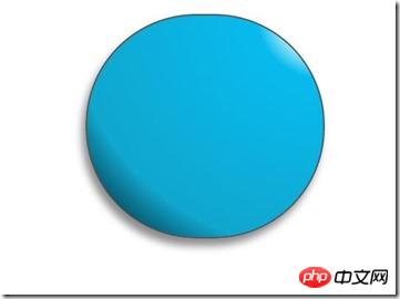
惊讶 shenmgui ,这么丑,别急,慢慢让它活过来:
/*脸部*/
.doraemon .face {
position: relative; /*让所有脸部元素可自由定位*/
z-index: 2; /*脸在头部背景上面*/
}
/*白色脸底*/
.doraemon .face .white {
width: 265px; /*设置宽高*/
height: 195px;
border-radius: 150px;
position: absolute; /*进行绝对定位*/
top: 75px;
left: 25px;
background: #fff;
/*此放射渐变也是使脸的左下角暗一些,看上去更真实*/
background: -webkit-radial-gradient(rightright top,#fff 75%,#eee 80%,#999 90%,#444);
background: -moz-radial-gradient(rightright top,#fff 75%,#eee 80%,#999 90%,#444);
background: –ms-radial-gradient(rightright top,#fff 75%,#eee 80%,#999 90%,#444);
}
/*鼻子*/
.doraemon .face .nose{
width:30px;
height:30px;
border-radius:15px;
background:#c93300;
border:2px solid #000;
position:absolute;
top:110px;
left:140px;
z-index:3; /*鼻子在白色脸底下面*/
}
/*鼻子上的高光*/
.doraemon .face .nose .light {
width:10px;
height:10px;
border-radius: 5px;
box-shadow: 19px 8px 5px #fff; /*通过阴影实现高光*/
}
/*鼻子下的线*/
.doraemon .face .nose_line{
width:3px;
height:100px;
background:#333;
position:absolute;
top:143px;
left:155px;
z-index:3;
}
/*嘴巴*/
.doraemon .face .mouth{
width:220px;
height:400px;
/*通过底边框加上圆角模拟微笑嘴巴*/
border-bottom:3px solid #333;
border-radius:120px;
position:absolute;
top:-160px;
left:45px;
}
/*眼睛*/
.doraemon .eyes {
position: relative;
z-index: 3; /*眼睛在白色脸底下面*/
}
/*眼睛共同的样式*/
.doraemon .eyes .eye{
width:72px;
height:82px;
background:#fff;
border:2px solid #000;
border-radius:35px 35px;
position:absolute;
top:40px;
}
/*眼珠*/
.doraemon .eyes .eye .black{
width:14px;
height:14px;
background:#000;
border-radius:7px;
position:absolute;
top:40px;
}
.doraemon .eyes .left{
left:82px;
}
.doraemon .eyes .rightright {
left: 156px;
}
.doraemon .eyes .eye .bleft {
left: 50px;
}
.doraemon .eyes .eye .bright {
left: 7px;
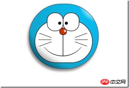
}写了这么多样式,结果是怎么样的呢: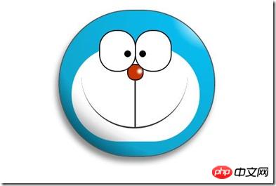
生病 怎么看都觉得别扭,哦!还差胡须须和白色脸底的边框呢,咱给补上:
/*胡须背景,主要用于挡住嘴巴的一部分,不要显得太长*/
        .doraemon .whiskers{
            width:220px;
            height:80px;
            background:#fff;
            border-radius:15px;
            position:absolute;
            top:120px;
            left:45px;
            z-index:2;   /*在鼻子和眼睛下面*/
        }
        /*所有胡子的公用样式*/
        .doraemon .whiskers .whisker {
            width: 60px;
            height: 2px;
            background: #333;
            position: absolute;
            z-index: 2;
        }
        /*右上胡子*/
        .doraemon .whiskers .rTop {
            left: 165px;
            top: 25px;
        }
        /*右中胡子*/
        .doraemon .whiskers .rMiddle {
            left: 167px;
            top: 45px;
        }
        /*右下胡子*/
        .doraemon .whiskers .rBottom {
            left: 165px;
            top: 65px;
        }
        /*左上胡子*/
        .doraemon .whiskers .lTop {
            left: 0;
            top: 25px;
        }
        /*左中胡子*/
        .doraemon .whiskers .lMiddle {
            left: -2px;
            top: 45px;
        }
        /*左下胡子*/
        .doraemon .whiskers .lBottom {
            left: 0;
            top: 65px;
        }
        /*胡子旋转角度*/
        .doraemon .whiskers .r160 {
            -webkit-transform: rotate(160deg);
            -moz-transform: rotate(160deg);
            -ms-transform: rotate(160deg);
            -o-transform: rotate(160deg);
            transform: rotate(160deg);
        }
        .doraemon .whiskers .r20 {
            -webkit-transform: rotate(200deg);
            -moz-transform: rotate(200deg);
            -ms-transform: rotate(200deg);
            -o-transform: rotate(200deg);
            transform: rotate(200deg);
        }
微笑 这样就对了,看着多舒服啊!趁热打铁,做脖子和身体:
/*围脖*/
        .doraemon .choker {
            width: 230px;
            height: 20px;
            background: #c40;
            /*线性渐变 让围巾看上去更自然*/
            background: -webkit-gradient(linear,left top,left bottombottom,from(#c40),to(#800400));
            background: -moz-linear-gradient(center top,#c40,#800400);
            background: -ms-linear-gradient(center top,#c40,#800400);
            border: 2px solid #000;
            border-radius: 10px;
            position: relative;
            top: -40px;
            left: 45px;
            z-index: 4;
        }
        /*铃铛*/
        .doraemon .choker .bell {
            width: 40px;
            height: 40px;
            _overflow: hidden; /*IE6 hack*/
            border: 2px solid #000;
            border-radius: 50px;
            background: #f9f12a;
            background: -webkit-gradient(linear, left top, left bottombottom, from(#f9f12a),color-stop(0.5, #e9e11a), to(#a9a100));
            background: -moz-linear-gradient(top, #f9f12a, #e9e11a 75%,#a9a100);
            background: -ms-linear-gradient(top, #f9f12a, #e9e11a 75%,#a9a100);
            box-shadow: -5px 5px 10px rgba(0,0,0,0.25);
            position: absolute;
            top: 5px;
            left: 90px;
        }
        /*双横线*/
        .doraemon .choker .bell_line {
            width: 36px;
            height: 2px;
            background: #f9f12a;
            border: 2px solid #333;
            border-radius: 3px 3px 0 0;
            position: absolute;
            top: 10px;
        }
        /*黑点*/
        .doraemon .choker .bell_circle{
            width:12px;
            height:10px;
            background:#000;
            border-radius:5px;
            position:absolute;
            top:20px;
            left:14px;
        }
        /*黑点下的线*/
        .doraemon .choker .bell_under{
            width: 3px;
            height:15px;
            background:#000;
            position:absolute;
            left: 18px;
            top:27px;
        }
        /*铃铛高光*/
        .doraemon .choker .bell_light{
            width:12px;
            height:12px;
            border-radius:10px;
            box-shadow:19px 8px 5px #fff;
            position:absolute;
            top:-5px;
            left:5px;
            opacity:0.7;
        }
        /*身子*/
        .doraemon .bodys {
            position: relative;
            top: -310px;
        }
        /*肚子*/
        .doraemon .bodys .body {
            width: 220px;
            height: 165px;
            background: #07beea;
            background: -webkit-gradient(linear,rightright top,left top,from(#07beea),color-stop(0.5, #0073b3),color-stop(0.75,#00b0e0), to(#0096be));
            background: -moz-linear-gradient(rightright center,#07beea,#0073b3 50%,#00b0e0 75%,#0096be 100%);
            background: -ms-linear-gradient(rightright center,#07beea,#0073b3 50%,#00b0e0 75%,#0096be 100%);
            border:2px solid #333;
            position:absolute;
            top:265px;
            left:50px;
        }
        /*白色肚兜*/
            .doraemon .bodys .wraps {
                width: 170px;
                height: 170px;
                background: #fff;
                background: -webkit-gradient(linear, rightright top, left bottombottom, from(#fff),color-stop(0.75,#fff),color-stop(0.83,#eee),color-stop(0.90,#999),color-stop(0.95,#444), to(#000));
                background: -moz-linear-gradient(rightright top,#fff,#fff 75%,#eee 83%,#999 90%,#444 95%,#000);
                background: -ms-linear-gradient(rightright top,#fff,#fff 75%,#eee 83%,#999 90%,#444 95%,#000);
                border: 2px solid #000;
                border-radius: 85px;
                position: absolute;
                left: 72px;
                top: 230px;
            }
            /*口袋*/
            .doraemon .bodys .pocket {
                width: 130px;
                height: 130px;
                border-radius: 65px;
                background: #fff;
                background: -webkit-gradient(linear, rightright top, left bottombottom, from(#fff),color-stop(0.70,#fff),color-stop(0.75,#f8f8f8),color-stop(0.80,#eee),color-stop(0.88,#ddd), to(#fff));
                background: -moz-linear-gradient(rightright top, #fff, #fff 70%,#f8f8f8 75%,#eee 80%,#ddd 88%, #fff);
                background: -ms-linear-gradient(rightright top, #fff, #fff 70%,#f8f8f8 75%,#eee 80%,#ddd 88%, #fff);
                border: 2px solid #000;
                position:absolute;
                top: 250px;
                left: 92px;
            }
            /*挡住口袋一半*/
            .doraemon .bodys .pocket_mask {
                width: 134px;
                height: 60px;
                background:#fff;
                border-bottom: 2px solid #000;
                position:absolute;
                top: 259px;
                left: 92px;
           }
好吧,脖子和身子都有啦!上图: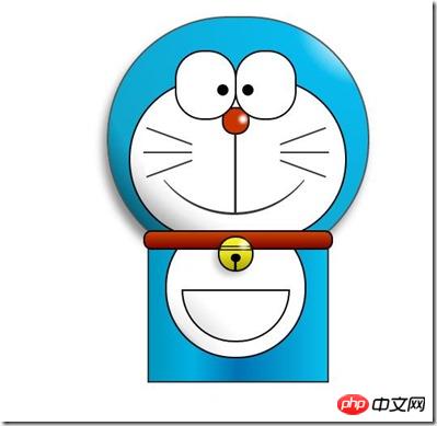
现在看起来有点像摆设品,不过笑容还是那么单纯,好了,赶紧把手脚做出来:
/*左右手*/
            .doraemon .hand_right, .doraemon .hand_left {
                height: 100px;
                width: 100px;
                position: absolute;
                top: 272px;
                left: 248px;
            }
            /*左手*/
            .doraemon .hand_left {
                left: -10px;
            }
            /*手臂公共部分*/
            .doraemon .arm {
                width:80px;
                height:50px;
                background: #07beea;
                background: -webkit-gradient(linear, left top, left bottombottom, from(#07beea),color-stop(0.85,#07beea), to(#555));
                background: -moz-linear-gradient(center top, #07BEEA, #07BEEA 85%, #555);
                background: -ms-linear-gradient(center top, #07BEEA, #07BEEA 85%, #555);
                border: 1px solid #000000;
                box-shadow: -10px 7px 10px rgba(0, 0, 0, 0.35);
                z-index: -1;
                position: relative;
            }
            /*右手手臂*/
            .doraemon .hand_right .arm {
                top: 17px;
                -webkit-transform: rotate(35deg);
                -moz-transform: rotate(35deg);
                -ms-transform: rotate(35deg);
                -o-transform: rotate(35deg);
                transform: rotate(35deg);
            }
            /*左手手臂*/
            .doraemon .hand_left .arm {
                top: 17px;
                background: #0096be;   /*背光一面使用纯色,使其有立体感*/
                box-shadow: 5px -7px 10px rgba(0, 0, 0, 0.25);
                -webkit-transform: rotate(145deg);
                -moz-transform: rotate(145deg);
                -ms-transform: rotate(145deg);
                -o-transform: rotate(145deg);
                transform: rotate(145deg);
            }
            /*圆形手掌公共部分*/
            .doraemon .circle {
                width: 60px;
                height: 60px;
                border-radius: 30px;
                border: 2px solid #000;
                background: #fff;
                background: -webkit-gradient(linear, rightright top, left bottombottom, from(#fff),color-stop(0.5,#fff),color-stop(0.70,#eee),color-stop(0.8,#ddd), to(#999));
                background: -moz-linear-gradient(rightright top, #fff, #fff 50%, #eee 70%, #ddd 80%,#999);
                background: -ms-linear-gradient(rightright top, #fff, #fff 50%, #eee 70%, #ddd 80%,#999);
                position: absolute;
            }
            /*右手手掌*/
            .doraemon .hand_right .circle {
                left: 40px;
                top: 32px;
            }
            /*左手手掌*/
            .doraemon .hand_left .circle {
                left: -20px;
                top: 32px;
            }
            /*手臂和身体结合处,使用背景遮住边框*/
            .doraemon .arm_rewrite {
                height: 45px;
                width: 5px;
                background: #07beea;
                position: relative;
            }
            /*右手结合处*/
            .doraemon .hand_right .arm_rewrite {
                top: -45px;
                left: 22px;
            }
            /*左手结合处*/
            .doraemon .hand_left .arm_rewrite {
                top: -45px;
                left: 60px;
                background: #0096be; /*同理,背光一面使用纯色,使其有立体感*/
            }
            /*脚部*/
            .doraemon .foot {
                width: 280px;
                height: 40px;
                position: relative;
                top: 55px;
                left: 20px;
            }
            /*左右脚共同样式*/
            .doraemon .foot .left, .doraemon .foot .rightright {
                width: 125px;
                height: 30px;
                background: #fff;
                background: -webkit-gradient(linear, rightright top, left bottombottom, from(#fff),color-stop(0.75,#fff),color-stop(0.85,#eee), to(#999));
                background: -moz-linear-gradient(rightright top, #fff, #fff 75%, #eee 85%, #999);
                background: -ms-linear-gradient(rightright top, #fff, #fff 75%, #eee 85%, #999);
                border: 2px solid #333;
                border-radius: 80px 60px 60px 40px;
                box-shadow: -6px 0 10px rgba(0, 0, 0, 0.35);
                position: relative;
            }
            .doraemon .foot .left {
                left: 8px;
                top: 65px;
            }
            .doraemon .foot .rightright {
                top: 31px;
                left: 141px;
            }
            /*双脚之间的缝隙,加阴影使用立体感*/
            .doraemon .foot .foot_rewrite {
                width: 20px;
                height: 10px;
                background: #fff;
                background: -webkit-gradient(linear, rightright top, left bottombottom, from(#666),color-stop(0.83,#fff), to(#fff));
                background: -moz-linear-gradient(rightright top, #666, #fff 83%, #fff);
                background: -ms-linear-gradient(rightright top, #666, #fff 83%, #fff);
                /*制作半圆效果*/
                border: 2px solid #000;
                border-bottom: none;
                border-radius: 40px 40px 0 0;
                position: relative;
                top: -11px;
                left: 130px;
                _left: 127px;
            }
好了,最后完整结果: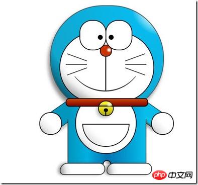
看一下,效果是不是和一开始的一样呢 大笑 ,虽然做好了,但是还是可以让它动起来的,比如眼睛,我们可以给它加个动画效果,让眼睛转动起来:
/*眼珠*/
        .doraemon .eyes .eye .black {
            width: 14px;
            height: 14px;
            background: #000;
            border-radius: 7px;
            position: absolute;
            top: 40px;
            -webkit-animation: eyemove 3s linear infinite;
            -moz-animation: eyemove 3s linear infinite;
            -ms-animation: eyemove 3s linear infinite;
            -o-animation: eyemove 3s linear infinite;
            animation: eyemove 3s linear infinite;
        }
        /*让眼睛动起来*/
        @-webkit-keyframes eyemove {
            70%{
                margin:0 0 0 0;
            }
            80% {
                margin: -22px 0 0 0;
            }
            85% {
                margin: -22px 0 0 5px;
            }
            90% {
                margin: -22px 10px 0 0;
            }
            93% {
                margin: -22px 0 0 0;
            }
            96% {
                margin: 0 0 0 0;
            }
        }
        @-moz-keyframes eyemove {
            70% {
                margin: 0 0 0 0;
            }
            80% {
                margin: -22px 0 0 0;
            }
            85% {
                margin: -22px 0 0 5px;
            }
            90% {
                margin: -22px 10px 0 0;
            }
            93% {
                margin: -22px 0 0 0;
            }
            96% {
                margin: 0 0 0 0;
            }
        }
        @-o-keyframes eyemove {
            70% {
                margin: 0 0 0 0;
            }
            80% {
                margin: -22px 0 0 0;
            }
            85% {
                margin: -22px 0 0 5px;
            }
            90% {
                margin: -22px 10px 0 0;
            }
            93% {
                margin: -22px 0 0 0;
            }
            96% {
                margin: 0 0 0 0;
            }
        }
        @keyframes eyemove {
            70% {
                margin: 0 0 0 0;
            }
            80% {
                margin: -22px 0 0 0;
            }
            85% {
                margin: -22px 0 0 5px;
            }
            90% {
                margin: -22px 10px 0 0;
            }
            93% {
                margin: -22px 0 0 0;
            }
            96% {
                margin: 0 0 0 0;
            }
        }
OK,这样,眼睛就会动了,有兴趣的可以试一下,这里就无法展示了。但是如果你有什么更好的动画效果也可以尝试,那么这个案例就结束了。
PS:虽然这只是一个案例,不过确实帮助我开阔思维,而且其实做一个这样的效果,可能会花费很多时间,至少对我来说目前确实是这样子,主要难点还是布局定位和颜色的合理搭配,才能使形象更加逼真生动!
以上就是本文的全部内容,希望对大家的学习有所帮助,更多相关内容请关注PHP中文网!
相关推荐:


