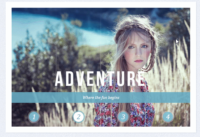
需实现的效果如下
Sliding Image Panels with CSS3
Sliding Image Panels with CSS3
SerendipityWhat you've been dreaming of
AdventureWhere the fun begins
NatureUnforgettable eperiences
SerenityWhen silence touches nature
下面这个是style1.css
.cr-container{
    width: 600px;
    height: 400px;
    position: relative;
    margin: 0 auto;
    border: 20px solid #fff;
    box-shadow: 1px 1px 3px rgba(0,0,0,0.1);
}
.cr-container label{
    font-style: italic;
    width: 150px;
    height: 30px;
    cursor: pointer;
    color: #fff;
    line-height: 32px;
    font-size: 24px;
    float:left;
    position: relative;
    margin-top:350px;
    z-index: 1000;
}
.cr-container label:before{
    content:'';
    width: 34px;
    height: 34px;
    background: rgba(130,195,217,0.9);
    position: absolute;
    left: 50%;
    margin-left: -17px;
    border-radius: 50%;
    box-shadow: 0px 0px 0px 4px rgba(255,255,255,0.3);
    z-index:-1;
}
.cr-container label:after{
    width: 1px;
    height: 400px;
    content: '';
    background: -moz-linear-gradient(top, rgba(255,255,255,0) 0%, rgba(255,255,255,1) 100%);
    background: -webkit-gradient(linear, left top, left bottom, color-stop(0%,rgba(255,255,255,0)), color-stop(100%,rgba(255,255,255,1)));
    background: -webkit-linear-gradient(top, rgba(255,255,255,0) 0%,rgba(255,255,255,1) 100%);
    background: -o-linear-gradient(top, rgba(255,255,255,0) 0%,rgba(255,255,255,1) 100%);
    background: -ms-linear-gradient(top, rgba(255,255,255,0) 0%,rgba(255,255,255,1) 100%);
    background: linear-gradient(top, rgba(255,255,255,0) 0%,rgba(255,255,255,1) 100%);
    filter: progid:DXImageTransform.Microsoft.gradient( startColorstr='#00ffffff', endColorstr='#ffffff',GradientType=0 );
    position: absolute;
    bottom: -20px;
    right: 0px;
}
.cr-container label.cr-label-img-4:after{
    width: 0px;
}
.cr-container input.cr-selector-img-1:checked ~ label.cr-label-img-1,
.cr-container input.cr-selector-img-2:checked ~ label.cr-label-img-2,
.cr-container input.cr-selector-img-3:checked ~ label.cr-label-img-3,
.cr-container input.cr-selector-img-4:checked ~ label.cr-label-img-4{
    color: #68abc2;
}
.cr-container input.cr-selector-img-1:checked ~ label.cr-label-img-1:before,
.cr-container input.cr-selector-img-2:checked ~ label.cr-label-img-2:before,
.cr-container input.cr-selector-img-3:checked ~ label.cr-label-img-3:before,
.cr-container input.cr-selector-img-4:checked ~ label.cr-label-img-4:before{
    background: #fff;
    box-shadow: 0px 0px 0px 4px rgba(104,171,194,0.6);
}
.cr-container input{
    display: none;
}
.cr-bgimg{
    width: 600px;
    height: 400px;
    position: absolute;
    left: 0px;
    top: 0px;
    z-index: 1;
}
.cr-bgimg{
    background-repeat: no-repeat;
    background-position: 0 0;
}

.cr-bgimg p{
    width: 150px;
    height: 400px;
    position: relative;
    float: left;
    overflow: hidden;
    background-repeat: no-repeat;
}

.cr-bgimg p span{
    position: absolute;
    width: 150px;
    height: 400px;
    top: 0px;
    left: -150px;
    z-index: 2;
}

.cr-container input.cr-selector-img-1:checked ~ .cr-bgimg,
.cr-bgimg p span:nth-child(1){
    background-image: url(../images/1.jpg);
}

.cr-container input.cr-selector-img-2:checked ~ .cr-bgimg,
.cr-bgimg p span:nth-child(2){
    background-image: url(../images/2.jpg);
}

.cr-container input.cr-selector-img-3:checked ~ .cr-bgimg,
.cr-bgimg p span:nth-child(3){
    background-image: url(../images/3.jpg);
}

.cr-container input.cr-selector-img-4:checked ~ .cr-bgimg,
.cr-bgimg p span:nth-child(4){
    background-image: url(../images/4.jpg);
}

.cr-bgimg p:nth-child(1) span{
    background-position: 0px 0px;
}

.cr-bgimg p:nth-child(2) span{
    background-position: -150px 0px;
}

.cr-bgimg p:nth-child(3) span{
    background-position: -300px 0px;
}

.cr-bgimg p:nth-child(4) span{
    background-position: -450px 0px;
}

.cr-container input:checked ~ .cr-bgimg p span{
    -webkit-animation: slideOut 0.6s ease-in-out;
    -moz-animation: slideOut 0.6s ease-in-out;
    -o-animation: slideOut 0.6s ease-in-out;
    -ms-animation: slideOut 0.6s ease-in-out;
    animation: slideOut 0.6s ease-in-out;
}
@-webkit-keyframes slideOut{
    0%{ left: 0px; }
    100%{ left: 150px; }
}
@-moz-keyframes slideOut{
    0%{ left: 0px; }
    100%{ left: 150px; }
}
@-o-keyframes slideOut{
    0%{ left: 0px; }
    100%{ left: 150px; }
}
@-ms-keyframes slideOut{
    0%{ left: 0px; }
    100%{ left: 150px; }
}
@keyframes slideOut{
    0%{ left: 0px; }
    100%{ left: 150px; }
}
.cr-container input.cr-selector-img-1:checked ~ .cr-bgimg p span:nth-child(1),
.cr-container input.cr-selector-img-2:checked ~ .cr-bgimg p span:nth-child(2),
.cr-container input.cr-selector-img-3:checked ~ .cr-bgimg p span:nth-child(3),
.cr-container input.cr-selector-img-4:checked ~ .cr-bgimg p span:nth-child(4)
{
    -webkit-transition: left 0.5s ease-in-out;
    -moz-transition: left 0.5s ease-in-out;
    -o-transition: left 0.5s ease-in-out;
    -ms-transition: left 0.5s ease-in-out;
    transition: left 0.5s ease-in-out;
    -webkit-animation: none;
    -moz-animation: none;
    -o-animation: none;
    -ms-animation: none;
    animation: none;
    left: 0px;
    z-index: 10;
}
.cr-titles h3{
    position: absolute;
    width: 100%;
    text-align: center;
    top: 50%;
    z-index: 10000;
    opacity: 0;
    color: #fff;
    text-shadow: 1px 1px 1px rgba(0,0,0,0.1);
    -webkit-transition: opacity 0.8s ease-in-out;
    -moz-transition: opacity 0.8s ease-in-out;
    -o-transition: opacity 0.8s ease-in-out;
    -ms-transition: opacity 0.8s ease-in-out;
    transition: opacity 0.8s ease-in-out;
}
.cr-titles h3 span:nth-child(1){
    font-family: 'BebasNeueRegular', 'Arial Narrow', Arial, sans-serif;
    font-size: 70px;
    display: block;
    letter-spacing: 7px;
}
.cr-titles h3 span:nth-child(2){
    letter-spacing: 0px;
    display: block;
    background: rgba(104,171,194,0.9);
    font-size: 14px;
    padding: 10px;
    font-style: italic;
    font-family: Cambria, Palatino, "Palatino Linotype", "Palatino LT STD", Georgia, serif;
}
.cr-container input.cr-selector-img-1:checked ~ .cr-titles h3:nth-child(1),
.cr-container input.cr-selector-img-2:checked ~ .cr-titles h3:nth-child(2),
.cr-container input.cr-selector-img-3:checked ~ .cr-titles h3:nth-child(3),
.cr-container input.cr-selector-img-4:checked ~ .cr-titles h3:nth-child(4){
    opacity: 1;
}
/* Media Query: Let's show the inputs on mobile sized browsers because they probably don't support the label trick: */
@media screen and (max-width: 768px) {
    .cr-container input{
        display: inline;
        width: 24%;
        margin-top: 350px;
        z-index: 1000;
        position: relative;
    }
    .cr-container label{
        display: none;
    }
}
如果按照上面的代码,个人感觉CSS处理逻辑略微复杂、html结构也不够清晰,不知道有没有更好的的方法实现同样的效果。


Copyright 2014-2025 https://www.php.cn/ All Rights Reserved | php.cn | 湘ICP备2023035733号


 3
3 1326
1326


 收藏
收藏


- -这就是4块【无缝滚动】拼起来的。。
需要注意的是获取图片数量时,只获取每个区域下的,不要搞混淆。
写了个简单的例子,拿去参考下:
https://jsfiddle.net/hqojLLL4/1/
把它当成4个单图的幻灯片来做,做出一个就能出4个
可以用background-position来分割图片